Downtown is the literal and figurative heart of a city. Since the advent of efficient transportation corridors enabled cities to sort themselves into largely separate commercial, industrial, and residential sections, downtown has been viewed as “the” business district. For about a century and a half, Americans have also imbued the centers of cities with symbolic meaning. Indeed, downtown is almost fixed in the imagination as a timeless place, a store of memories. Ask older generations and you’ll probably hear stories about peering into fanciful display windows, seeing Santa Claus, eating in a cafeteria or department store tearoom, riding on streetcars and wooden escalators, or marveling at the endless selection of every imaginable type of merchandise.
But downtown has never been as static as it is in the imagination. Rather, it has always been in flux. No one’s memory can capture all the changes, and few can pinpoint patterns of change beyond vague generalities. It turns out that city directories offer a bridge toward a more detailed understanding of how a downtown district has changed. City directories were compendia of residents, businesses, and institutions with associated addresses that were widely used in U.S. cities from the 19th century through most of the 20th century. In their original format, they are heavy, cumbersome volumes filled with thousands of pages of tiny print. What if we might unlock the understandings these directories promise through data visualization?
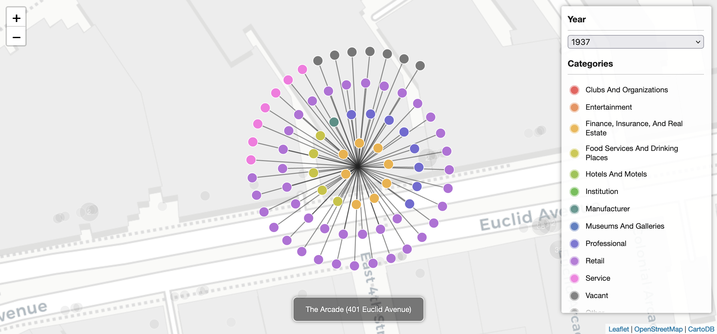
This question led the Center for Public History + Digital Humanities to develop a database drawn from the city directory listings of addresses in the downtown portion of Cleveland’s Euclid Avenue (the city’s traditional commercial spine). With seed funding from the Cleveland State University Office of Research in 2020-22, the Center set out to create a visualization of eight decades of change on Euclid Avenue. Director Mark Souther, developer Erin Bell, and graduate students Sarah White and Cheyenne Florence gathered city directory data, created a simplified typology of building-use categories for addresses at street level (along with pedestrian-oriented interior spaces like lobbies, mezzanines, arcades, and concourses), and developed a web-based visualization that combined an interactive map and bar chart.
The finished prototype, part of a website we named Visual Cleveland, uses circular color-coded pins and larger pin clusters on the map to reveal changes along the city’s “Main Street.” Between our beginning and end points of 1937 and 2019, you can literally watch the purple-coded retail uses gradually thin out and the lime-green shaded food-and-drink businesses proliferate. Visit the visualization exhibit to explore these and other changes using the map and chart, and test the visualization against your own experience of downtown. To learn more about preliminary findings, read our white paper.
We anticipate that this city directory visualization may provide a foundation for either a fuller exploration of downtown Cleveland’s long transformation or a model for similar work in other cities through a future grant.